ChatGPT, Cheating & Transforming Education (Short Essay)

A short essay on the rise of ChatGPT and its influence on education.

ChatGPT is a revolutionary technology that has gained attention in recent years for its ability to generate coherent text responses through natural language processing. This AI language model has been programmed to respond to a variety of prompts with seemingly human-like responses, and its potential applications range from chatbots to virtual assistants. However, with its advanced capabilities, ChatGPT has also raised concerns about its impact on academic integrity. Some individuals worry that students may use ChatGPT to produce essays or other academic works, thereby undermining the validity of their assessments. Furthermore, there is controversy surrounding ChatGPT’s ability to generate biased or inaccurate information, which could have far-reaching consequences. As such, this essay will examine the potential effects of ChatGPT on academic integrity, as well as the ongoing debates surrounding its use (OpenAI, 2023).

Spoken straight out of the computer’s mouth, the introduction to this essay was produced not by an undergraduate student slaving away at their laptop, but rather by ChatGPT, an artificial intelligence that – by prime example in the introduction to this essay – has the power to uproot the Internet. Written with the following prompt, it was only a matter of seconds before a fully fleshed-out 150-word essay introduction appeared on the screen.

“Write me a 150-word introduction to an essay about ChatGPT – address what ChatGPT is, its potential effects on academic integrity, and the controversy surrounding it” 

In a digital revolution, ChatGPT and its associates are taking the reins and toying with what we once knew about artificial intelligence, offering instruments of image generation, music production, essay writing, and code solving – the list is truly endless. Despite the revolutionary nature of this technology, ethical considerations of these tools in an academic context is a conversation surrounded by fiery debate and controversial opinions. As such, this essay will touch on the pros and cons of AI/ChatGPT for students, as well as re-evaluate academic integrity and honesty in an educational setting.

At the dawn of ChatGPT’s breakthrough, it all seemed too good to be true. As OpenAI even addresses in their introduction of ChatGPT, their technology is imperfect and still full of limitations (OpenAI, 2022). Nonetheless, artificial intelligence capable of creating just about anything with a simple prompt is the work of both dreams and nightmares. It is fast, efficient, intelligent (Hoyos, 2023), and best of all, easy. For students, when the deadline is cutting close and finishing (or just starting) an assignment seems impossible, ChatGPT can, with the click of a button, provide a quick, realistic, and simple solution – whether it be a short paragraph, completed essay, or even just a skeleton of an academic paper. As discussed in a study performed by Tlili et. al (2023), the discourse around implementing ChatGPT in an educational setting is generally positive. This recent qualitative study demonstrated results of “safe and responsible” (Tlili et al., 2023, p.1) integration of ChatGPT in an academic context, encouraging “embracing the technology rather than banning it” (Tlili et al., 2023, p.18). That being said, the concerns with the accuracy of these sorts of chatbots are not to be ignored. As Thorp (2023) states, “ChatGPT is fun, but it is not an author” (p.1).  Despite ChatGPT’s extensive access to all of the internet’s knowledge, it still struggles to produce high-quality academic writing (Thorp, 2023) and creates work that may be nonsensical, misleading, incorrect, or containing bias (Hoyos, 2023; OpenAI, 2023). Irigaray & Stocker (2023) also unpack the ways in which the wide-scale set of text data that builds up ChatGPT leaves it susceptible to the “prejudices and stereotypes” (p.1)  found in these texts, creating a final product that may be “discriminatory or offensive” (p.1). 

At the summit of the mountain of limitations presented by ChatGPT, is its speculated ability to compromise academic honesty, as well as put a damper on students’ creativity. The use of ChatGPT presents an ethically grey area, with the potential to inaugurate the downfall of academic integrity, independent problem-solving, and critical thinking. Being able to simply type a question into ChatGPT and receive a fully developed response will prevent students from developing skills in critical thinking and problem-solving (Irigaray & Stocker, 2023). In addition, students can easily copy or steal answers from the AI and quickly build a dependency on the software (Hoyos, 2023) while raising issues of plagiarism (Irigaray & Stocker, 2023). 

With this in mind, students have been finding ways to cheat long before the internet, and certainly long before artificial intelligence. With ChatGPT on the line, students are simply offered a new, innovative method of doing what has always been done.
Artificial intelligence appears boundless even at its early developing stages and is undoubtedly only going to grow in its capabilities and accuracy. Some public schools in Queensland, New York, and Los Angeles have started banning ChatGPT or creating harsh, strict guidelines around it, according to The Guardian and Global News. As they have always been in the education system, loopholes are inevitable. Therefore, what if banning ChatGPT is the incorrect course of action and if instead it were integrated as an educational asset? According to Global News, Canadian Universities are looking for ways to allow this technology in schools without placing a ban, ensuring a way that students are being “fairly and genuinely evaluated on meaningful exercises aimed at maximizing learning” (Mann, 2023). In the ever-growing technology era, working with AI rather than against it may be the only way to stay afloat. How, with ChatGPT joining the conversation, can educational institutions implement it as a resource, while simultaneously re-evaluating academic honesty, all without sacrificing the quality of students’ education? How can critical thinking and problem-solving skills continue to be tested and preserved with the implementation of such an advanced and limitless tool? How can it be regulated?

With ChatGPT in its baby stages and the marginal amounts of research in its department, these questions are being lived in rather than answered. Certainly, ChatGPT as a productivity tool offers clear advantages, being easy to use and incredibly advanced. Yet even with such impressive features, they act only as a silver lining around an otherwise looming dark cloud, potentially jeopardizing students’ education and blurring the lines of academic integrity.

References

Cassidy, C. (2023, January 22). Queensland public schools to join NSW in banning students from chatgpt. The Guardian. Retrieved March 14, 2023, from https://www.theguardian.com/australia-news/2023/jan/23/queensland-public-schools-to-join-nsw-in-banning-students-from-chatgpt
D’Andrea, A. (2023, February 1). Canadian universities crafting CHATGPT policies as French school bans AI program – national. Global News. Retrieved March 14, 2023, from https://globalnews.ca/news/9451143/chatgpt-education-canadian-universities/
Hoyos, A. A. (2023, February 9). Unpacking chatgpt: The Pros and cons of AI’s hottest language model. IE Insights. Retrieved March 14, 2023, from https://www.ie.edu/insights/articles/unpacking-chatgpt-the-pros-and-cons-of-ais-hottest-language-model/
Irigaray, H. A. R., & Stocker, F. (2023). ChatGPT: a museum of great novelties. Cadernos EBAPE.BR, 21(1), 1–5. https://doi.org/10.1590/1679-395188776x
OpenAI. (2022, November 30). Introducing chatgpt. Introducing ChatGPT. Retrieved March 14, 2023, from https://openai.com/blog/chatgpt
OpenAI. (2023, March 14). ChatGPT, personal communication. https://chat-gpt.org/chat
Thorp, H. H. (2023). ChatGPT is fun, but not an author. Science (American
Association for the Advancement of Science), 379(6630), 313–313. https://doi.org/10.1126/science.adg7879
Tlili, A., Shehata, B., Adarkwah, M. A., Bozkurt, A., Hickey, D. T., Huang, R., & Agyemang, B. (2023). What if the devil is my guardian angel: ChatGPT as a case study of using chatbots in education. Smart Learning Environments, 10(1). https://doi.org/10.1186/s40561-023-00237-x

Frankenjelly

This is probably the worst thing I have ever created.

I present to you, the Jellylift remix of all your favourite Jellycats, the Frankenjelly:

Frankenjelly

My original idea was to take some old stuffies, undo the stitching, and then stitch them back together all mixed up. But I couldn’t bring myself to do it, it seemed like it would hurt them, and I love them all too much. So I performed the Worlds Worst Photoshop job and created a Frankenjelly digital prototype. With a Bartholomew Bear body, Peanut Penguin wings, Amusable boots, Fabulous Fruit Strawberry head and Fuddlewuddle cat ears, this creature is sure to pay you a visit in your nightmares <3

It’s All Downhill From Here

Follow along as I continue to fuel my spiraling Jellycat addiction with the purchase of a new Amusable.

Did you know that there’s a f**king Jellycat section on campus in the SFU bookstore? You did, didn’t you? And to think you didn’t tell me… it’s impossible to find loyalty anywhere these days.

Somebody please take the Jellycats away from me before I go bankrupt (please, do not at any costs, take the Jellycats away from me). Last Wednesday, March 1st, I stumbled my way into the SFU Bookstore with a friend, to discover an entire stand of Jellycat plushies, including the Amusable Orange, Fabulous Fruit Plum, and Pongo Orangutan. And one little fella who stole my heart: the Amusable Rainbow.

Everyone, meet the Amusable Rainbow (unnamed).

Me n my Rainbow

Wednesday afternoon, during a trip to the Jellystore (SFU edition), I had to make the second hardest decision of my life. After having just bought two new Jellies, the idea of dropping money on yet another didn’t seem rational or realistic. I will have years and years to buy Jellies, I don’t need to buy yet another after I just purchased two. It was such a tough choice. He was $5 cheaper in the store than online or at any other toy store, and easily the best priced Jellycat there. But it’s like they say, if you love something… let it go.

And so I did just that. After wandering the SFU Jellystore holding the Rainbow for almost 30 minutes, I finally put it back on the shelf, and decided that if it’s meant to be… it’ll be. It’s the only one left, and if this poor orphaned thing is meant to be mine, he will be.

I left it for Friday. I decided if it’s there on Friday, I’ll buy it.

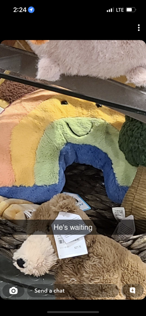
So I left. In a testament of my character, I left the Rainbow alone at the Jellystore, to the quiet and lonely nights of a closed bookstore… I was full of regret, and longing. Thursday afternoon, I get this image from a friend:

Image Text from a friend with the Amusable Rainbow waiting for me

Thar he lay, a little smile of hope stitched across his face. Friday, I told myself. Friday.

So I wait.

I think about him all night and all morning.

Friday afternoon, March 3rd. I have an exam from 2:30-4:30… The SFU Bookstore closes at 4:30.

I think about him before the exam and during the exam. So the moment I finish early, I grab my friends by their socks and drag them with me to see if he still awaits.

Out of breath, distressed and distraught, I stagger into the bookstore 30 minutes before closing, and there he was. Waiting.

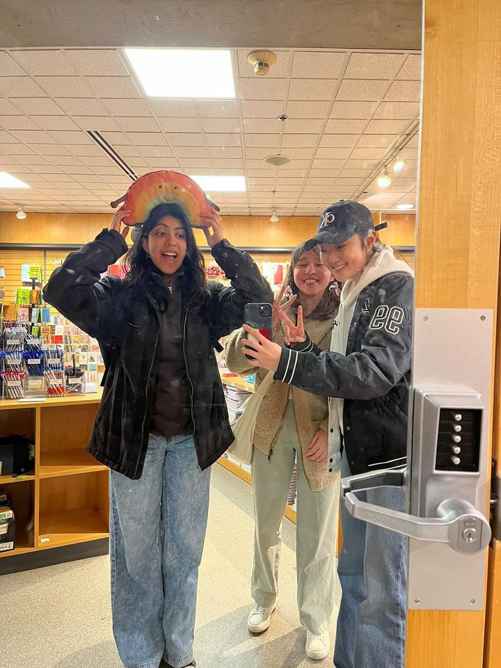
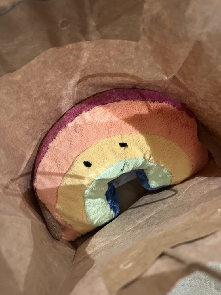
It was only a matter of minutes before he was not only in my arms, but in a bag with a proud receipt tucked inside.

Me and the girlies adopting the rainbow
RAINBOW ALL MINE

I was no longer hollow with regret, but rather full with love. An evening with the girlies followed suit, resulting in a day of treats; Rainbow, ramen, bubble tea, movie night. I couldn’t ask for a better day in my entire life.
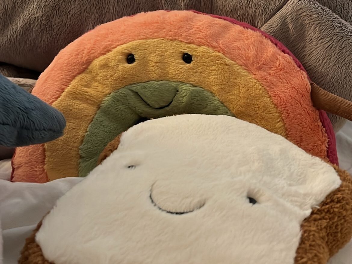
The Rainbow now sits at home on my bed, happier than ever, snug as a Jellybug in a rug.

Amusable Rainbow making good friends with Jimmy

Yet another successful Jelly adventure, with a new friend and another dent in my bank account – the latter being of less importance. Minor details! I have a Rainbow now! That’s all that matters!

(The Rainbow is also currently unnamed. Beebee, Jimmy, Patrick and… ???)

Feel free to give him a big wave hello, he is very friendly!

The Rise of the iPad Kids…

A brief discussion of children and their harmful access to the internet.

This post is in response to James Bridle’s “Something is Wrong on the Internet” (2017).

With topics of digital literacy and misinformation, I’ll sort take the reigns in a slightly different direction to build off of Bridle’s conversation of the can of worms called the Internet that we are opening up to children.

As an older cousin of a 6 year old and 4 year old, I’ve always been extremely puzzled by the types of content that my cousins watch. Occasionally I will catch them on YouTube watching play throughs of Super Mario Bros. that have no music or voiceover, and is just the game sound effects. These are typically 30 to 40 minutes long, and they will literally just sit there and watch it all the way through. As well as videos such as how to draw a cat but with no intention of getting out a piece of paper to actually follow the tutorial, and even unboxing videos of the most arbitrary things, similar to Bridle’s (2017) discussion of the incredibly weird popularity of opening Kinder Surprise Eggs. Despite the bizarre nature of these videos, there is nothing really wrong with them. But that isn’t the issue.
One time, I set up a coloring video for them on my laptop so we could draw together, and when I stepped away for 5 minutes to get them a snack, they had smothered their grimy, sweaty little child fingers all over my screen and managed to land on a video of Marvel superhero figurines beating the literal sh*t out of each other. Like, how did we get here?!? Not to mention the strange amount of videos filmed of Barbie dolls engaging in weirdly sexual activity? What the actual f**k is up with that.

In addition to the peculiarity of what children are seeing, it’s a matter of them seeing it all the time. Over the past few years, the term “iPad Kid” has made its mark, the stereotype of a child who is constantly glued to their iPad. The iPad Kid is often depicted as a toddler with horrendous posture, holding the screen way too close to their face and carrying it with them to the dinner table, to family events, and just about anywhere they can. It’s wild to think that while my generation grew up with street hockey in the cul-de-sac and water balloon fights and getting up at 6am to watch Pokémon, this new generation born in the Technology Era is getting anything and everything they could possibly think of shoved down their throats in digital form. I know for a fact that there is absolutely nothing that will get my little cousins to shut up better than putting ANYTHING on the television. Crying? Television. Hungry? Television. Tired? Television. Bored? Television. Being a goddamn menace because that’s what kids do and it’s a crucial step in how they grow and learn and become emotionally self-aware? Television.

After talking to a few of my peers, I was able to reflect on some very refreshing opinions of future parents having absolutely no desire for their children to even touch a smartphone until their early teen years. As a collective group, I think we can all see simply from an observational standpoint the irreversible damage of raising an iPad Kid.

Bridle (2017) puts it perfectly, referring to on-demand video as “catnip for both parents and to children.” Simply put, it’s a cop-out. Growing up, these kids aren’t going to know how to function independently, and will constantly rely on some sort of stimulation to feel whole or at peace. To reflect back on the start of this course, these kids have had their attention stolen before they even had it (Mod, 2017), born with an iPhone camera in their newborn faces. Before we can even discuss the implications of a screen addiction at the ripe age of 0, Bridle (2017) highlights the inevitable danger of simply exposing children to the Internet.

How on earth do we teach children to be digitally literate? How do you explain to a five-year-old how to use RADCAB or CRAAP (Caulfield, 2016) and use critical thinking to assess the video of Peppa Pig eating her father? If a busy parent doesn’t take the extra second to ensure that the videos they’re showing their child is indeed the official YouTube page, there’s nothing convincing us that a kid will. And with that, how do you even regulate a child being able to view a coloring video to, within a few clicks, watching Iron Man rip Spiderman to pieces? Most times out of a ten, a kid has absolutely no clue what they’re looking at and are thoughtlessly consuming videos that look cool and sound cool. As Bridle (2017) puts it in regards to the creation of these videos, “most of them are not trying to mess kids up, not really, even though they are,” and there is a system in place that is frightening and traumatizing children – whether it be intentional or not.

Bridle, James.  November, 2017. “Something is Wrong on the Internet”
Caulfield, Mike. December 19, 2016. Yes, Digital Literacy. But which one?
Mod, Craig. 2017. “How I Got My Attention Back.”

NOISE IN YOUR F**KING EARS!!!!!!!!!!!!!!!!!!!

BLAST THOSE TUNES AND PICKUP THEM HEAVY A** WEIGHT BABYYYYYYY

Okay okay. I know what you’re thinking. You’re thinking…
This is way more of a Jellycat blog than it is a lifting blog. I haven’t seen ONE picture or video of you weightlifting. I thought you said we were going to follow your weightlifting journey? YOU SAID you would stop gatekeeping!?

To which I say,

Lol my bad.

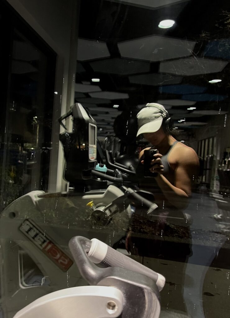
Listen, I’m not trying to be that a**hole in the gym with their phone and little thirty dollar Amazon tripod set up right in front of the mirrors where the rest of the community is simply trying to workout but are forced to deal with This B*tch filming videos of her incredibly mid physique and underwhelming lifts. I also lift at a pretty small gym, and whenever I decide to take videos to check my form, it’s usually from the most god awful angles to avoid catching any strangers in the frame. Maybe one day you’ll get actual footage of a jellyLIFT. But today is not that day.

Instead, I offer you my top 3 albums and top 5 songs to listen to to MOVE THE F**KING WEIGHT!

(heads up, most of it is objectively terrible and practically just noise)

albums

Album #1: 1000 gecs by 100 gecs

1000 gecs album art

If you have heard of or listened to 100 gecs before, you know exactly what to expect. This album sucks. My favourite tracks are ‘money machine‘ ‘xXXi_wud_nvrstøp_ÜXXx‘ and ‘800db cloud‘. I couldn’t give you one good reason why these ones are my favourites aside from the fact that they just are. If you really feel like jumping into it, check out the Injury Reserve remix of ‘745 sticky’, it’s sure to alter your brain chemistry.
100 gecs is a joke of a musical duo, yet they produce easily some of the most catchy, chaotic and stimulating music you can find. Honestly, it’s hardly music. But boy oh boy, minute 1:22 in ‘800db cloud’ definitely gets that weight moving like nothing else.

Album #2: The Money Store by Death Grips

The Money Store album art

I feel like this one can’t even be justified. The friend who first showed me Death Grips told me, “Listen to ‘I’ve Seen Footage‘, it’s probably one of their most digestible songs.” I thought to myself “what is this clown on about” until I gave it – and then the whole album – a listen and went “Oh, that’s what this clown is on about.” Fantastic album. I couldn’t tell you a single word that is sung throughout the entire thing. Makes me feel f**king psychotic. I can’t listen to it while I drive or else you’ll find freak car accidents all across the tri-cities. Top 3 tracks are ‘Hacker’, ‘Hustle Bones‘ and ‘Get Got‘ in that order. Give it a listen!

Album #3: Inside (Deluxe) by Mother Mother

Inside album art

Ok, now THIS. This is an exceptional album. It’s a concept album, and probably my favourite thing Mother Mother has ever produced. A handful of the tracks make use of ambient soundscapes either as the focal point or as a background feature of the song, which makes listening to this album a really immersive experience. Listening to some of these songs while you lift makes you feel like a demon. Top three tracks are ‘Two‘, ‘Sick of the Silence‘ and ‘Hayloft II’. Makes for a good listen outside of the gym too, as some of the songs are slower and a better listening experience in a dark room with headphones on.

songs

Song #1: Totalitarianism by STAYSOLD

Totalitarianism cover art

You can hardly call this a song.

Song #2: BADASS by ZillaKami and Lil Uzi Vert

BADASS cover art

I’ve hit countless PRs to this track. I always bench heavy with this sh*t blasting in my ears, that’s for sure.

Song #3: Side by Side by Bladee and Thaiboy Digital

Side by Side cover art

Me and my baby goin’ side by side, side side by side, side side by siddde

Song #4: MISA MISA! by CORPSE, Scarlxrd, and Kordhell

MISA MISA! cover art

Yes, yes I know it’s CORPSE, but cut me some slack because this goes so hard.

Song #5: poster by oaf1

poster cover art

I have no idea where or how I even found this song, but I’m pretty sure I listened to it every time I did lat-raises for like 2 months straight. It sort of feels like a fever dream.

Honestly, my list of lifting music recommendations is bottomless. I have three playlists I listen to while I lift, and handfuls of albums. Maybe I’ll link my Spotify here one day…

Nope. Just kidding. Never happening. My Spotify is going to be kept inside my gate.

Wrapping Up wrappedinablanket (Peer Review #2)

An in-depth review of the design features of wrappedinablanket – a peer’s blog!

click here to visit wrappedinablanket

For consistency’s sake, I’ll begin this peer review once again with a shout out to the blog admin, Veronika. Hey Veronika! I know you’re just itching to read my review of wrappedinablanket… So stay tuned!

the first impression

Veronika’s home page

The very first thing I thought of as I opened Veronika’s blog in a fresh new tab, was Gertz’s (2015) article on the current state of web design across the internet. I couldn’t help but giggle the moment I viewed Veronika’s home page: a darkened semi-transparent overlay, with a sans-serif font in white as the main header. This style of webpage was the opener to Gertz’s critique of web design, using this example to illustrate the ‘copycat culture’ and lack of originality of the internet. There was something rather comical about having come fresh off Gertz’s article directly into wrappedinablanket. The irony was killing me.

That being said, I’m not here to drone on with some self-righteous elitist bullshit about right and wrong web design as a means of establishing individuality in your online persona. I’m here to give an design review of a peer’s website!

veronika know’s her sh*t

First and foremost, I feel underqualified doing a design review of Veronika’s blog, as she is a SIAT student in graphic design, who specializes in photography and visual content design. I think her blog perfectly reflects her areas of expertise, and as they say to write what you know, it’s clear that Veronika designs what she knows. And she knows her sh*t.

Veronika’s blog looks clean and professional, and has more attention to detail than 90% of the PUB101 blogs. Before I even started reading the about page, I instantly knew that Veronika had some experience with digital design, and just design in general. It is very aesthetically pleasing to look at and
While I will admit that I agree with Gertz in that the overall theme of this blog lacks some originality, that isn’t to say that it doesn’t work.
I enjoy the way that the content of the blog – exiting one’s comfort zone – is something which is inherently uncomfortable, and is paired with a contrasting design aesthetic. I do not know if it was intentional, but it is definitely something that stuck out to me. I would’ve opted for crunchy and harsh visual design, but I definitely like how Veronika has laid out her blog. It is visually pleasing, the colours are gentle on the eyes and give off a soft, cozy and welcoming vibe that Veronika executes very well. She has created a space that makes you feel safe and welcomed in the process of trying new things and getting out of your comfort zone.

The layout follows a standard web page layout, with clear internal links to wherever you want to go, whether it be the about page, the blog, POSIEL, or contacting Veronika. She has also attached links to her social media, implemented within the menu as icons. It’s not in your face or impossible to find, it’s precisely where you want and expect it to be. As you scroll down on the homepage, the website has a fun sort of dynamic feel to it. The page scrolls with you, rather than you scrolling the page. It’s not a website feature I haven’t seen before, but is one of those things that brings it up a notch making the viewer feel more engaged with the page.
Usability certainly passes the test. The blog isn’t so loaded that every page takes a century to render, and the site is easy to navigate. Developing proficiency in using wrappedinablanket seems perfectly attainable, and after a good thirty minutes of exploring, I feel like I’ve already got most of it down pat. When observing Veronika’s website in contrast to many of my peers’ sites, it’s clear that she has put real heart and soul into the design aspect, and has put time and thought into creating a digital space with rhythm, unity and balance. On the topic of unity though, there was one little piece of the homepage that detached me from the overall vibe of her site.

The title “Welcome to wrappedinablanket” breaks form. Nowhere else is there scriptio continua on the website, and it feels a little unnatural and out of place from the typography throughout the rest of the blog. In addition, ‘wrappedinablanket’ does not have any other typographic emphasis on it to differentiate it from the other text, which in turn emphasizes that out-of-place feeling. To be fair, I am still yet to establish consistency in using the jellylift title across my blog, so I’ll cut Veronika some slack. 

wrappedinablanket all wrapped up

If I were to wrap up Veronika’s blog in one word, I would use the word predictable.
Now hold your horses! I know that the word predictable has a lot of negative connotations so let’s unpack this for a quick second.

The predictability of Veronika’s website is not a bad thing. It’s precisely what puts a viewer at ease, and invites them into her little corner of the internet. It has that sort of “clean Pinterest girl” aesthetic that appeals to many demographics and gives some insight into who Veronika is beyond wrappedinablanket. It checks all the boxes for usability, efficient layout and site structure. Veronika makes use of “intuitive everyday design” (Kaptelinen, 2014), a concept discussed in “Affordances” by Victor Kaptelinen. Kaptelinen (2014) offers that these affordances are what make users capable of new learning. We search for these affordances, based off prior knowledge and cultural influence, in the unknown. Veronika makes use of these affordances and intuitive everyday designs with features such as a recognizable website menu and familiar icons. This, among others, makes her site very user friendly. You know where to go, and you know what to expect.

If I’m getting picky, I encourage Veronika to crawl out of her cozy wrapped blanket and do just what her blog says, and get out of her comfort zone with her blog design. It’s clear she knows what she’s doing, and just by looking at the site anyone can tell she has a more professional eye than the rest of us. And I’m not saying to start from scratch. Wrappedinablanket looks and feels great, but wouldn’t suffer from a little bit of experimentation.

The design template is a great place to start, but what makes it yours? 

but idk tho ur def more qualified than me idk anything u do u bbg

Victor Kaptelinin. (2014). “Affordances.” The Encyclopedia of Human-Computer Interaction, Chapter 44. Interaction Design Foundation
Trevor Gertz. (2015). “Design Machines. How to survive in the digital apocalypse”

Journey to the Jellystore

Shopping for Jellycats, when a good friend and a credit card is all you really need.

Okay.

This might have been the best day of my entire life.

A few months ago, my friend and I discovered that the Indigo bookstore on Robson Street has a voluptuous supply of Jellycat plushies in stock. Given that the store is downtown, we decided that when we had some time, we would make a day out of it and treat ourselves to some Jellycats. But, as life as a students tends to go, we struggled to find that time and we were forced to put the Journey to the Jellystore on hold for a little while. And so reading break turns the corner, and before you could say Beebee the following conversation took place:

“I need me a reading break I’ve been losing my mind these past few weeks”
“Simon Fraser is really wearing thin on me”
“yeah no same here”
“i can’t wait i just want to sleep all week”
“WAIT”
“WAIT”
“jelly store???????????”
“during reading week!!?!??? please!!!!???
“Could that be Wednesday???”
“yes!!!?!!!!!!!”
“🤔🤔🤔🤔”
“That’s definitely in the cards”
“👀 👀 👀 👀 👀 👀 👀 “

Despite the question “jelly store??????????? during reading week!!?!??? please!!!!???”, it really wasn’t much of a question at all and he did not have a choice in the matter. We were GOING shopping for Jellycats, whether he liked it or not. And so…

Wednesday, February 22nd, 2023. In the middle of a peaceful break from school, an adventure downtown with a friend to go Jellycat shopping. Does it get any better than this?

I don’t think so.

I spent my morning at the gym and the library, getting my lift and my studies out of the way before my day really began. 1:00pm rolls around and my friend picks me up from the library and drives us to Commercial, where we hop on the Skytrain and commence the Journey. Despite the biting winds and chilly temperature, I’ve never felt more warm and fuzzy, and bursting with excitement! After a short walk from the station to the bookstore, we climbed a set of stairs to the upper floor where we were presented with Everything A Girl Could Possibly Hope For.

A Jellycat Display.

The Jellystore!

Yes. Jellycats are advertised as toys for infants, suggested by the poster of the literal baby and the racks of baby clothes. But that wasn’t going to stop me! When travelling downtown, the biggest gamble was whether or not the store would have the sandwich. My friend and I have discussed his profound desire for the sandwich ever since the day he laid eyes on it on the website. And so walking up to the display table where a row of sandwiches lay before him was probably the greatest moment of his life. Though I can’t say for sure.

I decided to browse a little bit, as I had no specific Jellycat in mind to purchase, aside from Edward Bear which I knew they didn’t have in stock. After battling with what Jelly to buy for far too long, I narrowed it down to the following:

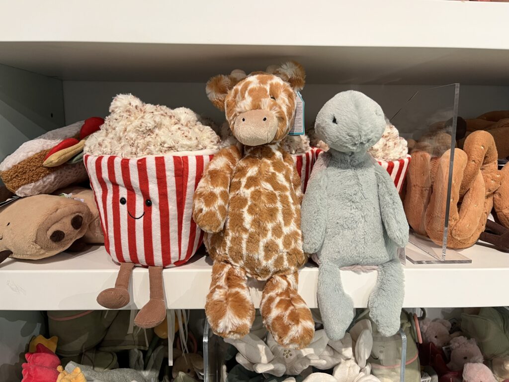
Amusable Popcorn, Bashful Giraffe, and Bashful Turtle

Amusable popcorn, Bashful Giraffe and Bashful Turtle just sittin around!

Popcorn because he’s awesome, giraffe because it was impossibly soft, and turtle because… just look at that face <3

It was quite a struggle. I stood there for ages going back and forth between the ones I wanted. I paced around a while, looking around a little more to make sure I hadn’t missed any Jellies, and it was then that I had a good proper look at the Amusable Toast. Quite large, soft, and priced at an ABSOLUTE steal. I couldn’t possibly turn it down! But I still wanted one of my three prior options…

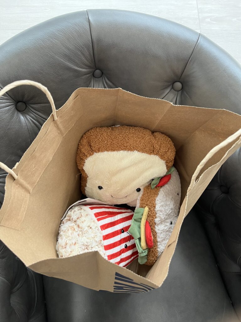
After what felt like an endless battle, I left a proud owner of an Amusable Toast and Amusable Popcorn.

Jellycat groceries!

It’s like I went grocery shopping. Very VERY expensive groceries.

We are NOT going to talk about how much it costed me to buy that toast and popcorn.

So don’t ask.

But it was worth it.

And after I tossed the little receipt in the bag, it was out of sight out of mind!

Money spent, sure. But not money wasted.

I didn’t think the day could possibly get better, until we decided to grab some soup for lunch and I indulged in some of the best soup and buttered baguette I’ve ever had. Nothing like hot soup on a cold day! With a bag of Jelly babies! It truly can’t get better than this!

Or can it…

The Jellycat Journey STILL wasn’t over. We got back to the car and made our way home with a little pit-stop on the way.

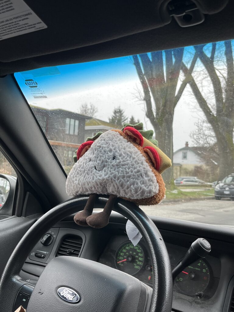
The Amusable Sandwich takes the wheel!

We had to hit the bedding store and as my friend shopped around for a new duvet cover, I was presented with YET ANOTHER Jellycat display in the store!!! What a pleasant and unexpected surprise! I was in such a state of shock that I forgot to snap a photo, but there were many lovely Jellies, including but not limited to the Bashful Monkey, Fuddlewuddle Lamb, Ricky Rain Frog, Riverside Rambler Fox and Riverside Rambler Mole! I desperately wanted one of those Riverside Ramblers but alas… my Jellycat dollars were already well spent.

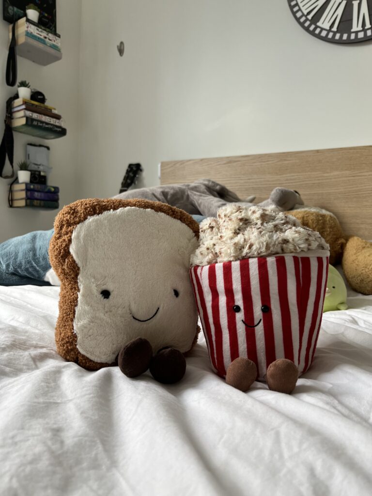
As the most perfect day in history came to a close, I returned home to my warm cozy bed, where I had the pleasure of giving the toast and popcorn a true home. I sent pictures of my beloved new Jellies to just about everyone I know, and over multiple conversations, graced them with the names Jimmy (toast) and Patrick (popcorn). My prized possessions and darling treasures.

Jimmy and Patrick, best of friends!

Upon some deep reflection, I think the Journey to the Jellystore is one big, beautiful metaphor for friendship. Only a real one would travel with you in the freezing cold out to the dreadful streets of downtown Vancouver. Only a real one would put up with your childlike whining and indecisiveness over stuffed plushie foods. Only a real one would share the pain of dropping a hot dollar on a Jellycat with you.
And so sure. Maybe Jimmy and Patrick were a hit to my bank account. Maybe I spent a lot of money on these little treasures. Maybe it was a long and cold journey for what to most, seems like a small reward. But maybe it was never about the money. Maybe it was never even about the stuffies!

Maybe the real treasure was the friends we made along the way.

Design and Digital Demise

Virginia to Vegas. Official Website. GO!

When thinking about a website who’s design elements I was to critique, the first thing that came to mind was the Virginia to Vegas Official Website. Virginia to Vegas (Derik John Baker) is a Canadian indie-pop music artist who, over the course of his career, has shaped and molded himself to fit a certain aesthetic. His color palette is mostly neutral and earthy tones, and feels very dreamy with a touch of melancholy. Most of his music is upbeat-sad breakup shit that all sounds the same, exempt from “Malibu” and maybe “betterman,” but my Virginia to Vegas music critique can be saved for another time. 

Visiting his site feels like stepping into a room where the walls and ceiling and floor are all painted white, and someone tells you to “GO.” Where am I going? What am I doing? What is my purpose? SOMEONE GIVE ME A SIGN?

See for yourself if you haven’t already: Virginia to Vegas Official Website

overall visuals

In terms of design, Virginia to Vegas doesn’t miss. It’s clear that his objective is that minimalist, quirky and artsy style. Very simple, nothing busy, all very balanced, using very basic symmetry to appeal to the eye. In terms of other design elements such as rhythm and unity, I think that opting for the simple minimalist style helps to check these boxes. The colors all go nicely together, and help to emphasize his sort of modern-indie aesthetic as an artist. That being said, I don’t think having such a small header was the best design choice in terms of proportion. Having it stand out more, or even in a different color could help to balance the page out some more as well as add some clarity to the site.
Scrolling down, you find multiple wide-set tabs that display a photo of Derik with links to his new album and newest lyric video. I think the way that these tabs don’t take up the whole screen and keep the homepage in the background is very visually satisfying. I’ve not seen anything quite like this done before, and reminded me a touch of the formatting in the Gertz (2015) reading. In which Gertz (2015) offers that “everything looks the same,” something I think Virginia to Vegas’ website managed to escape at least a little bit, while still keeping that standard simple modern look. That being said, I find that the way the image for the home page was shot having the guitar head out of the frame sort of cuts the balanced feel, but that’s if I’m being picky. It feels as though you should be able to scroll down and see the full image, or watch it morph into something new. On that note, that’s my main design issue.

to he** with the scroll

Initially, when you arrive at the site, you’re presented with Derik! You quite honestly can’t miss him. Right there, smack center of the page. But then what? There’s side widgets with small social media icons, suggesting links to all his social platforms, as well as a small chunky header on the top of the page. To begin with, this header is a light gray, which doesn’t contrast nicely against the light background, making it a little difficult to identify the images beneath the “Virginia to Vegas” title header. Eventually you realize that’s part of his brand logo and site icon, but that doesn’t really get you anywhere. Click the header? It’s not a link. Click Derik? He’s not a link. Click the widgets? Oh no! Suddenly you’re on his Instagram! You don’t want to be there, you’re trying to see things on his website.

Do you see where I’m going with this? The whole nature of the homepage image makes it feel as though you’re waiting for something to load, and it takes a moment before realizing what you need to do is scroll. Yet even when you do scroll, it doesn’t take you far. There’s only two external links on the wide-tabs, and a column of links to his social media. What about tour dates? Merch? A mailing list? Just general news and information about Virginia to Vegas? You’ve walked into a white room and been told “Go.” 

I’m inclined to believe that Derik’s own design could be his digital demise. But on the flip side…

is it all so bad?

With this critique in mind, I wouldn’t be surprised if there was a method to his madness. The slight lack of clarity is just enough to make you want to explore the site, and do some digging. It’s like a little adventure. In doing so, he also beats the very typical website layout, such as that of The Weeknd’s Official Website, which has your standard horizontal menu sitting atop an array of images and videos you can scroll through.
In comparison, I think the Bleachers Official Website does an excellent job of presenting a unique and fun page, while still ensuring clarity and interest. In fact, the Bleachers site has quite a funky homepage, that feels sort of busy and chaotic while still maintaining symmetry and balance, as well as a clear point of focus.

sorry for being so harsh, Derik

Overall, I think Virginia to Vegas’ website has great design aesthetics, but is slightly lacking on design functionality. From my experience, most times out of ten when I visit an artist’s page, I care to find tour dates and news – something which isn’t clearly expressed on Virginia to Vegas’ page. But! Perhaps his modern, minimalist, quirky, neutral-toned, modern hippie-esque, indie fanbase knows exactly where to go and what to find, and that is Derik’s public, and his dreamy design may not be his digital downfall, but rather his upswing.

Gertz, Travis. 2015. “Design Machines. How to survive in the digital Apocalypse.”

Jellylift Needs a Facelift

Fixing up the form of jellylift, and my struggles with keeping my people happy

As I continue to develop jellylift, as much as I am bursting with ideas, my site is bursting with problems. 

After surpassing the initial troubles of figuring out how to use WordPress, issues of design flexibility, site clarity, and navigation began presenting themselves to me. I discovered I can’t attach widgets to the sides of my website, forcing everything into one column, and the post categories don’t offer a thumbnail or clip which links to the whole post, but rather displays the entire post while you’re scrolling. And most of all, over this week, I received feedback from four separate sources that my site was difficult to navigate. It was unclear where to find the newest posts, the menu headers didn’t make sense, and the colours blended together too easily, making it difficult to read large bodies of text.
This was a hard pill to swallow, as I had worked especially hard to make my blog very organized and straightforward. Personally, I hate learning how to work a new website where the layout is super scattered and impossible to navigate, which is why I opted for the very minimalist style, with few links to click and spaced out wording that emphasizes the important parts of a text. Yet, despite my efforts to create aesthetically pleasing and easy to follow visuals, my only negative feedback was on just that – the visuals. 

To me, the navigation made perfect sense. I can see where the confusion may have lain in my old menu headers such as “omg hey – the dry part – the fun part”, but only if you don’t explore the blog enough. After not even 20 seconds on each of those pages, I found it to be extremely clear as to what their purposes were. Regardless, I decided to strip jellylift of that unique characteristic, and opted for something more standard: “omg hey – about – all posts.” I didn’t like this change very much, but concluded that it was more user friendly and accessible to first-time visitors. To solve the issue of not being able to find the newest post (which I also thought was clear, but maybe I’m just high up on my horse and terribly unreceptive to criticism) I implemented an internal link that teleports you to the ‘all posts’ page, where the newest post is at the very top of the list. For colours, I darkened the background and lightened the text, which hopefully helps. I never saw an issue with the colours clashing to begin with and am not able to tell whether the slight changes I made helped at all and so, to all my beloved readers who had trouble with the colour contrast… this one’s for you <3.

To add to my troubles, I installed a site-editor plug-in (because I’d had enough with WordPress), tried it, hated it, uninstalled it, and it totally screwed up all my previous work. The font was all wacky, the colour blocking was wrecked, the photos were in weird orders, and the text formatting got all jumbled up. I had to go and reverse it all and even now some pages don’t look the way they used to. I’m inclined to believe that these marginal details go unnoticed by a visitor who isn’t constantly staring at the site and editing it daily, but it’s still driving me nuts. Will jellylift ever be the same again? Or is she forever changed? I suppose we can only wait and find out.

All my struggles with website layout and form brings me to the article “Contents May Have Shifted” by Erin Kissane (2013), in which Kissane discusses how the form of standard content we have always known seems to be shifting and losing its traditional structure. She refers to how our standard digital workbook style webpages and editors are beginning to “turn liquid” (Kissane, 2013) and melt into something less cookie cutter. These platforms are now meant to be flexible, and we can start to see the meshing of forms such as the example she gives of the use of GIFs in newspaper articles. In a physical copy of a newspaper, you could never implement a GIF right smack center of a New York Times print, fresh off the press! Yet here we are, in this liquid form of what once was a newspaper, with short moving pictures planted in the story-telling of politicians saying the wrong things and cats being saved from trees. Even books have not only their digital, but their auditory counterpart, fumbling with the idea we once had of what a ‘book’ was. 

Kissane’s (2013) article along with our class discussion forced me to reflect on how my site might benefit from this amalgamation of form, as “content that can fit into many containers” (Kissane, 2013). How might implementing different forms of content and media enhance or limit jellylift? It seems like a lot to wrap my head around with everything that already needs fixing, to suddenly start worrying about its flexibility in design. I’ve been thinking about what an impact that layout and form has on my audience, and how it is integral in keeping their attention. After looking at jellylift on my phone, I quickly discovered that it does not transfer well onto a mobile device, and left me wondering if maybe jellylift needs a renovation. As previously mentioned, after toying around with the theme I chose I began to uncover all the limitations that this minimalist template offers. This structure puts me in a difficult position as I continue to ponder the future of jellylift.

Do I completely change the template?
Is user-friendliness more important than personal preference?
Do I need to sacrifice the simplicity of jellylift for the sake of flexibility and relatability?
Will packing different forms of media into the site steal from the minimal and straightforward aesthetic I originally intended to achieve? 
Could there possibly be a way to satisfy everyone?

So many questions, so little answers… 

Will jellylift ever reach true perfection? 

Kissane, Erin. 2013. “Contents May Have Shifted” in Contents Magazine 4. Available from: http://contentsmagazine.com/articles/contents-may-have-shifted/

Physique Update #1

A current snapshot of my progress! Be grateful, this may be the first and the last physique update ever posted to jellylift.

Not gonna lie, I’ve had this idea drafted for my blog since I first booted up the site, but have been actively avoiding sharing it as content ever since.
While I made this blog with the intention of documenting and sharing my fitness progress, when it came down to posting content about lifting, I realized I had no desire to actually share any personal information regarding my progress.

Why?

Because I LOVE to gatekeep.

Ooooh yeah baby, there is nothing I love more than than a little bit of self-righteousness mixed with manipulation, sprinkled with just a dash of insecurity. Yep, I sure do love to actively and consciously limit access (provide no details) to the public (friends and family) to a category or status (my progress) in an attempt to uphold exclusivity and/or maintain a sense of novelty about said category or status as a means of elevating myself to offer a sense of superiority (I’m tremendously insecure and do not wish to be judged.)

But alas, my gatekeeping era is coming to a bitter-sweet end as I reluctantly swallow my pride and share the following images.

Physique Update #1 – February 9th, 2023

Big shoulders in the rec centre windows

These images were taken on February 9th, 2023, just under a year after I had been consistently working out. For almost five years, I had been very on and off about working out, and only ever did so at home using Youtube videos, apps, and Instagram fitness challenges. In the 11th grade at the peak of COVID-19 online learning, in my Health and Physical Education course we were encouraged to create our own workout program at home and implement it for the rest of the semester. This forced me to learn about fitness beyond the scope of trying a new sport every year and never sticking to one, high school dodgeball, and the Zumba class I would join in with my mother once in a blue moon.
I’ll spare you the dry sob story of how I slowly learned to fall in love with weightlifting. That can of worms can be dumped onto a future jellylift post.

Back to the present!

Right now, I am training for hypertrophy and am in a caloric surplus, more commonly referred to as a “bulk.” I’m consuming around 2600-2800 calories daily, with the intention of dropping into a 300-500 calorie deficit in a few months – the “cut.” To be completely transparent, my bulk isn’t going quite as smoothly as I would like. Let me break it down

  • Days I forget to pack extra food on my 7:30am-5:30pm school days really set me back
  • When I’m at work, I can’t eat for 4-5 hours
  • Days I burn more calories due to more intensive training or lots of movement throughout the day puts me at maintenance with the calories I’m consuming (input = output, rather than, input > output)
  • Food and groceries are expensive
  • Healthy food is not typically high in calories, therefore maintaining a healthy diet and trying to eat a lot of food can be tricky
  • My family does not eat in the same way that I do, and do not often cook with whole foods but rather with what is cheaper and convenient (which I truly can’t blame them for)

If you look closely at this list, you’ll notice a trend between each of them.

They’re all excuses.

Don’t get me wrong. It isn’t easy. I’ll be the first to tell you that the hardest part of being healthy and fit (and big and strong) is diet. By far.

I’ve never been the type to eat poorly. At a young age, I grew out of having a sweet tooth, and quickly discovered how much better I feel when I eat good food. The difficult part now, is simply consistency. Keeping up with consuming 145g of protein and 2800kcals every single day affects you mentally just as much as it does physically. For someone my age, height and size, It’s a LOT of food, no matter how much you’re training. It’s hard, and mentally draining, and challenging.

But I love it. I’m learning to love the process in anticipation of the results, and it’s only a matter of time before I truly get to enjoy the fruits of my labour. I think the best part of this journey is that once I reach my destination, I get to set a new goal, and go through hell all over again.
But, as Daddy Noel says:

If you’re going through hell…

Keep going.